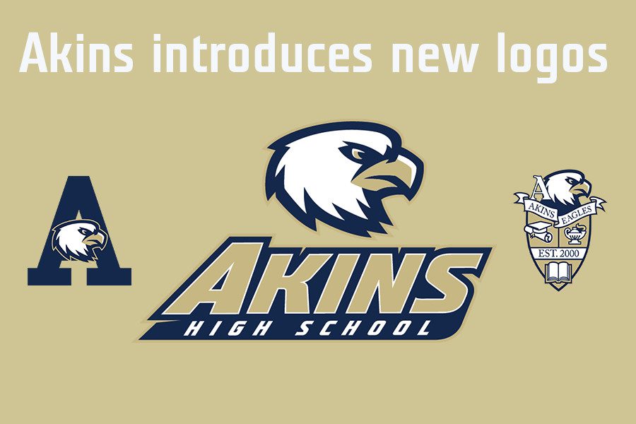
Akins recent logo is designed to symbolize unity and pride
November 5, 2016
Strength. Agility. Bravery.
These are words that often come to mind when people think of eagles. However, if someone was to ask 10 random students what the Akins Eagle looks like, they would probably get 10 different answers.
That’s the problem that Principal Brandi Hosack sought to address when she commissioned VIP Branding to develop a new logo and branding guide for the campus. The campus’ original logo was designed more than 15 years ago, and since then various teams, clubs and programs have created dozens of different logos featuring different looking Eagles.
“If you look around our campus, you might see a different eagle around every corner,” Hosack said.
She said she hopes the new logo will help students create a sense of unity and increase school pride. Hosack said she expected the new logo to be used everywhere on campus, including campus signage, club fliers and even campus letters home to parents.
“Part of school is pride is being able to center yourself around an image that everyone identifies with,” she said.
Now that logo is created, the next challenge though is getting the various organizations to use it on their T-shirts, fliers and various other paraphernalia.
Softball coach Anthony Degelia said he appreciates having the new logo.
“I think anytime you do something new it helps with the atmosphere and change in the culture of the school,” Degelia said. “When you show the students you care about something it becomes a domino effect and the kids start to get excited.”
In the gym, the floor was just replaced this summer, but it doesn’t include the new logo, but the new design was completed before the work was scheduled.
It may take time for the athletics teams to use the new logo on their uniforms because the teams will have to wait for their current funding cycles to end before they can purchase new ones.
For athletic teams and their jersey, the new logo will not be used right away. The baseball team will likely be the first team to use the new logo because it’s uniform cycle will be renewed next year, Degelia said.
David Distelhorst, Akins Journey Theatre director, recently created a new logo for the program, which includes an eagle that looks different from the new eagle logo. He said he is still figuring out how he might use the new logo although he is considering at least using the new official school colors in his version.
“I designed it and went to the administration. They saw it and they liked it and they approved it,” he said.
Yearbook teacher Sean Claes, who has experience with managing branding campaigns, said that everyone on campus needs to be familiar with the branding guide that was produced with the new logo. The guide includes official school colors, fonts and even examples of improper uses of the logo.
“For the most part, if you are streamlining the branding of the campus, that needs to be the singular logo used throughout the campus,” he said.
He said any organizations should use the new logo that was just introduced.
“It has to be taken on a case to case basis. That’s why it would be important to have a brand manager on all this,” he said.


